This little page is sort of my freaky attempt to compile all the GG case / box / whatever else design info I have, trying to show you in how many ways they changed little things here and there from time to time in order to keep us GG gamers happy (and, just by the way, make more money).
When the GG was first made public in 1991, they had a simple design in Europe, as this picture shows:
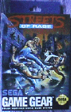
On the contrary, the stuff sold in the US was packed quite differently, actually allowing more indviduality for each accessoir / game:
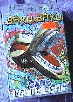
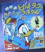
The japanese design is even more open-minded. Each box and manual is different (the boxes are also smaller), and only the GG logo (the one like that on the GG itself) always is the same. The manuals are colored thorougly and have more images / screen shots than the European / US manuals:
After some time, the European part of Sega must have realized that the original design was way too boring, so they allowed some of the games to be packed more according to the game than to a packaging standard:

The manuals with this also were more changing, now often being separated into seven books one after the other in one rather than one manual in seven languages simultaneously. However, the accessoires and GGs sold remained packed the old "boring" way. And some new games also still had (and have) the old look.
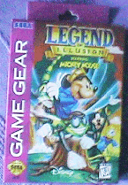
Some time later, I believe in 1994, Sega of America also changed the design completely and came up with this new purple look:
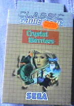
Meanwhile, I think in early 1995, Sega Europe thought up another method how to sell more older games: They just packed them in a brownish box saying "Classic Game Gear" and that was it! A classic GG games should sell more than an ordinary one. Of course they left cartridge and manual look as it had been before:
And now this is getting really freaky...
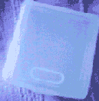
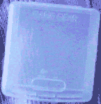
Because they didn't just change box and manual look. There were also a few changes in the game cartridge plastic boxes. You know, the boxes you use for game cartridge storage so they don't catch too much dust and stuff. First, there was this design all over the world:
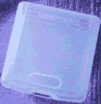
This box had the japanese Game Gear logo on the upper front part (like the logo next to the GG screen on the GG itself). On the back, the three words "Made in Japan" made everything clear. While Sega of America were introducing their new purple GG look (as shown above), they also made up their own version of the GG cartridge case: